From Hand-Painted Boards to AI-Powered Assets
What began with a brush on wood now scales across pixels and prompts. Visual Design became my language — from street-inspired art to scalable campaigns that move minds and markets.

Design is not my signature; it's a service: A dialogue where a client’s vision becomes style, and style becomes scalable.
AI-Generated Experience
From Leaks to Living Images: Generative Experiments in Motion
During a six-month course at FocusMedia, I explored how AI could shape campaign assets. Unusual prompts with most image generators leaked or collapsed into clichés. A Midjourney–Photoshop ping-pong, stretched across time, layering iteration over iteration. Results I hadn’t planned — not my idea exactly, but surprising, living images that opened new creative ground.
AI didn’t follow me — it surprised me, and that became the point.
Riding frozen Waves


Brand Identity Refresh
From Logo to Living System
The Challenge
A brand that felt static needed more than a facelift — it needed a design language that could adapt across channels without losing its core.
The Result
A modular identity system that breathes: scalable across print and digital, rooted in clarity, and strong enough to grow with the brand.


Social-Media
Scaling Social without Losing Soul
At Xeit we managed multiple clients in parallel — from Got2Be and Bell to ZKB, Caotina, Ovomaltine and EWZ. Tight approval loops, short timelines in photo and film production, and the pressure to react fast to real events demanded more than speed. With collaborative workflows, asset libraries and automation we built a system that kept production fast and brand voices consistent across channels.
Structure turned chaos into clarity — and clarity into trust.


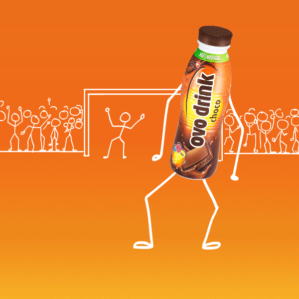
Ovomaltine Social-Media
Fast, fun and consistent: scaling Ovomaltine’s social voic
Ovomaltine faced the challenge of producing high volumes of posts in three languages with one consistent style. We defined visual rules, built an asset library with Illustrator templates and automated workflows. This enabled fast, scalable production and a unified brand appearance across all channels.
Consistency turned speed into trust — and trust into engagement.


2016–2019
My Role: Lead Digital Designer
Services: Art Direction, Graphic Design, Artwork, Animation, Photography, Project-Management
Orange – transformation
Turning Guidelines into a Living Brand
Challenge
How to motivate and reach every employee — from office to shop floor — with a multimedia platform that lives up to the brand’s promise of being “the human telco”?
Result
A print and digital e-flipbook that made guidelines tangible: playful, warm and accessible. Even colleagues not online-savvy could feel the brand’s spirit. With quirky lines like “Oops, we messed up — here’s how we fix it” or “We talk like people, not like contracts”, the tone turned rules into real dialogue — human, humorous and memorable.


Lifestyle Flyer Collection
From Music Stages to Freeski Slopes
To bridge the gap between insiders and newcomers, we investigated what truly resonates with lifestyle audiences. The result: a flyer collection that turned bold typography and striking imagery into a visual bridge. Designed to inform and inspire, the assets worked seamlessly across print, social, and magazines — building recognition from music stages to freeski slopes.

1996–today
My Role: Freelance Designer
Services: Visual Concept, Graphic Design, Asset Adaptation, Cross-Channel Design, Production
Snowboard Designs
From Ride Culture to Visual Statement
In summer I designed boards, in winter I rode them. Nearly 200 boards for brands like F2, Duotone, Nidecker, Salomon, Crap, Clisade, Jester and Santa Cruz carried my lines from sketch to slope. Fashion prints for Chiemsee and Matador took the spirit beyond the mountains.
Design wasn’t decoration — it was my way of living snowboarding.


Duotone Snowboards
With Duotone we turned freeride into an attitude and shaped snowboarding as an expression of individuality and creativity.
In the mid-90s F2 lost credibility, while U.S. brands with aggressive freestyle aesthetics dominated the scene. We searched for a stance that could inspire youth and ignite creativity. Duotone emerged as a brand that defined freeride as individual expression. Collaborations with partners like Orthodox opened new playgrounds in the backcountry. What began as a subbrand grew into an internationally recognized snowboard label — keeping the spirit of “surfing frozen waves” alive.
Duotone proved that design can be more than style — it can be a culture.


1992–1997
My Role: Freelance Designer & Freeride Opinion Leader
Service: Brand Concept, Graphic Design, Artwork
© 2025 Matze Lenz. All rights reserved. Imprint